
How to Combine Furniture Colors: Interior Color Matching Guide for Home Furnishings
2026-11-08
When you master thoughtful color pairing for your home furnishings, you elevate the room’s aesthetic — and boost your quality of life.
Picking the wrong furniture hues only to discover they clash with your existing decor can lead to major regret. That is why this curated guide breaks down exactly how to combine furniture colors.
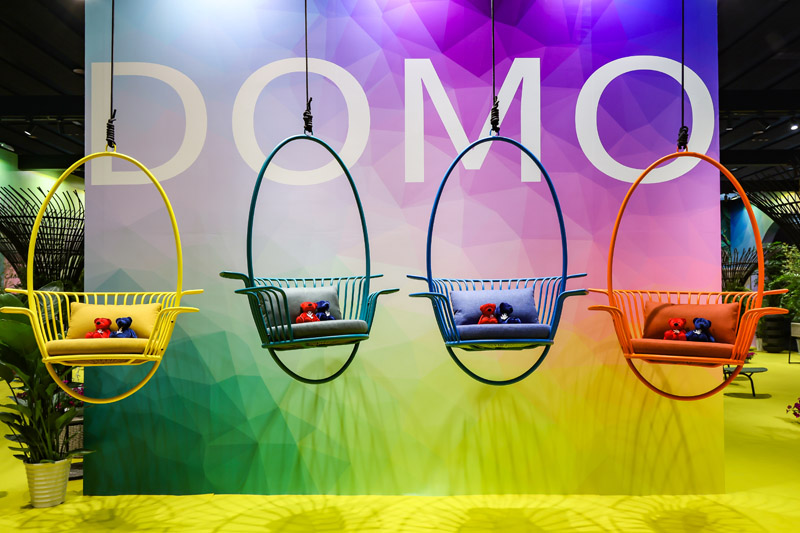
how to combine furniture colors?A Systematic Guide to Furniture Color Coordination:
1.The Golden Color Rule: The 60-30-10
Ratio Research in neuropsychology shows excessive color stimulation causes mental fatigue, while too few colors create a bland, lifeless look. The classic interior design 60-30-10 rule sets the ideal balance:
60% Base Tone: Applied to walls, flooring and large window drapes. Stick to neutrals (white, beige, light gray, natural wood tones). These calm the visual senses and create a feeling of comfort and stability.
30% Secondary Accent Color: Reserved for large furniture pieces, including sofas, dining tables, wardrobes and TV consoles. This forms the structural backbone of your interior and defines the room’s overall style.
10% Accent Pop Color: Used for smaller furniture and soft furnishings such as accent chairs, throw pillows, rugs, artwork and decorative objects. These elements prevent the space from feeling dull. Rooms relying solely on secondary colors often look flat and dated.
This aligns with the figure-ground principle from Gestalt psychology. The theory states the human brain automatically separates what we see into background and foreground elements. In furniture selection, the 60% portion creates the perfect background, while the combined 30% plus 10% forms the distinct focal subject.
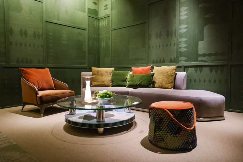
2.Unsure How to Pick Colors? Learn These 4 Popular Furniture Color Formulas!
These four frameworks work well for most residential interiors:
1)Monochromatic / Gradient Palette
The Safest, Most Refined Option Stick to one base color and vary its lightness and saturation for coordination. The result feels visually cohesive, safe and sophisticated.
Example: Light gray walls paired with a charcoal main sofa, a smoke gray accent chair, plus woven off-white textiles with varied textures.
2)Analogous Color Scheme
Warm, Natural and Layered Select two to three hues sitting next to each other on the color wheel (examples: yellow + orange + brown, or blue + teal + green). This adds color variety without harsh visual conflict, achieving balanced harmony.
Example: Warm brown-and-yellow dining set paired with a warm yellow patterned area rug and an olive green accent chair.
3)Complementary Color Pairing
Bold, Energetic and Distinctive Pair two opposite hues from the color wheel for striking contrast (examples: blue and yellow, green with reddish-brown or blush pink). This artistic style has strong visual impact and suits creative young households.
The legendary New York designer and color master Jonathan Adler coined his famous happy design principle: “Never fear contrasting colors; safe equals boring. A caramel leather chair set against Klein blue is like a brilliant handclap frozen within a still room.”
Example: Navy main sofa paired with a caramel leather accent chair or golden throw pillows.
Tip: Avoid a 50:50 equal split for contrasting pairs. Use one color as the dominant tone and limit the other to just 10%–20% as an accent. If you want both colors prominent, build a visual bridge between them. A deep green main sofa plus a dusty rose accent chair (10%) may feel jarring when placed side by side. Hang an abstract painting featuring both deep green and dusty rose tones on the wall. This artwork acts as a visual bridge to unify the two contrasting hues.
4)Neutrals + Bright Accents
Timeless and Foolproof Keep all large furniture in neutral tones (black, white, gray, beige, natural wood). Introduce high-saturation colors only through smaller furnishings. This approach is highly forgiving. It also makes style updates simple later on; you only need to swap small soft furnishings.
Example: Oat fabric sofa and light wood coffee table, accented with one Klein blue jacquard accent chair.
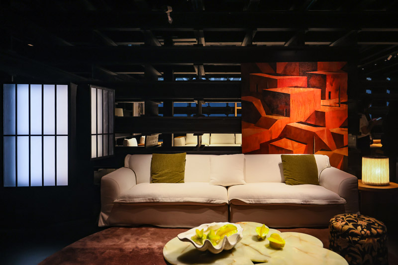
3.Beyond Color: Never Overlook Furniture Material Texture
Same Hue, Different Textures:
An all-gray interior can easily feel rigid. But mixing a gray tweed sofa, gray matte lacquer coffee table and gray wool rug creates rich depth through differences in light reflection. Belgian minimalist master and Wabi-Sabi icon Axel Vervoordt noted: “Monochromatic spaces are not dull — if you use texture instead of hue to create variation.”
Wood Tone Mixing Rule:
Many homeowners worry mixing different wood finishes will look messy. Follow this simple guideline: Warm-toned woods (walnut, cherry, warm oak) can be blended together. Cool-toned woods (bleached ash, cool gray oak) are best kept separate from reddish or yellowish rosewood.
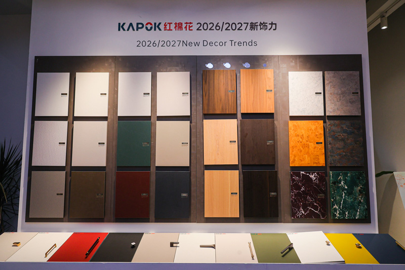
Common Mistakes to Avoid
✕ Do not use more than three main colors throughout the whole house; the space will look cluttered, overwhelming and visually draining.
✕ Do not ignore natural lighting: Rooms with poor light benefit from furniture in lighter, brighter warm hues. Well-lit rooms can handle bold deep tones such as dark olive green, near-black and deep burgundy.
✕ Do not disregard the base color of flooring or tiles. Always consider contrast with the floor when buying large furniture. Avoid placing a deep reddish-brown sofa on dark rosewood flooring. If you must, separate them with a rug of a different shade.
Legal Disclaimer
Disclaimer: This content is for general informational purposes only and is not professional interior design consultation. Color perception varies based on room lighting, material finishes and screen displays. Always test paint, fabric and wood samples on-site before purchasing large furniture. The publisher assumes no liability for dissatisfaction with color selections, material mismatches or design outcomes. All designer quotes are used for illustrative purposes and do not constitute paid endorsements.
References
- Benjamin Moore. The 60-30-10 Color Rule for Interior Design.
- Architectural Digest. How to Mix and Match Furniture Colors. Pantone. Interior Color Theory & Complementary Color Basics.
- Axel Vervoordt. Wabi-Sabi Interior Design Philosophy.
- Jonathan Adler. Design Philosophy & Color Interview.
- Apartment Therapy. How to Mix Different Wood Tones in One Room. National Association of the Remodeling Industry. Lighting’s Impact on Interior Color.
- Gestalt Theory for Interior Design, Design Matters Magazine.